
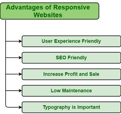
Responsive design is crucial for a positive user experience across various devices and screen sizes. The purpose of this study is to examine the importance of responsive design in user experience:
Multi-Device Usage:
Users access websites and applications on a variety of devices, including smartphones, tablets, laptops, and desktops. Responsive design ensures that the user interface adapts seamlessly to different screen sizes and resolutions, providing a consistent experience.
Enhanced Accessibility:
A responsive design accommodates users with disabilities by providing a flexible layout that can be easily adapted to different assistive technologies and screen readers. This inclusivity is a key aspect of good user experience.
Improved SEO:
Search engines, such as Google, prioritize mobile-friendly websites in their rankings. Responsive design can positively impact your site’s search engine optimization (SEO) by providing a single URL for all devices, making it easier for search engines to index and rank your content.
Cost-Efficiency:
Maintaining a separate mobile version of a website or application can be expensive and time-consuming. Responsive design streamlines development and maintenance efforts, as you only need to manage one set of code that adapts to different devices.
Consistent Branding:
A responsive design ensures that your brand’s identity, including colors, fonts, and overall style, remains consistent across various devices. Consistency in branding contributes to a cohesive and recognizable user experience.
Increased User Engagement:
Users are more likely to engage with content that is easily accessible and readable on their preferred devices. Responsive design optimizes the layout and content presentation, leading to higher user engagement and satisfaction.
Adaptability to Future Devices:
As new devices with different screen sizes and resolutions emerge, a responsive design allows your website or application to adapt without requiring a complete redesign. This future-proofing aspect is essential for staying relevant in a rapidly evolving technological landscape.
Faster Page Loading:
Responsive design can contribute to faster page loading times, especially on mobile devices. This is crucial for retaining user interest and preventing high bounce rates, as users tend to abandon sites that take too long to load.
Analytics and Reporting:
Managing a single set of analytics for a responsive site is more straightforward than dealing with separate analytics for different versions (e.g., mobile and desktop). This consolidated approach provides a unified view of user behavior, helping in data analysis and decision-making.
In summary, responsive design is a fundamental element of a positive user experience, addressing the diverse needs and preferences of users across various devices and platforms. It contributes to accessibility, search engine visibility, cost-effectiveness, and adaptability, ultimately leading to increased user satisfaction and engagement.